Internal
Design catalog
Every token, component, and pattern used on capption.com — in one place.
Design tokens
Brand colors
Type scale
| Token | Value | Use |
|---|---|---|
--fs-display | 6rem / 96px | H1 |
--fs-h2 | 4rem / 64px | H2 |
--fs-h3 | 3rem / 48px | H3 |
--fs-h4 | 2rem / 32px | H4 |
--fs-subtitle | 1.75rem / 28px | Subtitle, large body |
--fs-lead | 1.375rem / 22px | Strong paragraph, nav |
--fs-body | 1.125rem / 18px | Body |
--fs-body-sm | 1rem / 16px | Small body |
--fs-caption | 0.875rem / 14px | Captions, labels |
Radius & shadow
Typography
Atkinson Hyperlegible — primary body & heading font
Used for all body copy, headings, nav links, and buttons.
Heading 2
h2 / clamp(1.875rem → 4rem) · --fw-bold · lh 1Heading 3
h3 / clamp(1.625rem → 3rem) · --fw-bold · lh 1.1Heading 4
h4 / clamp(1.375rem → 2rem) · --fw-bold · lh 1.1Subtitle — large intro copy that sets context before the detail.
.text-subtitle / 1.75rem / lh 1.4Lead — strong paragraph or call-to-action text.
.text-lead / 1.375rem / lh 1.3Body — default paragraph text at 1.125rem / 18px. Atkinson Hyperlegible was designed for low-vision readers; its use here is a product commitment, not an aesthetic choice.
body / --fs-body / lh 1.6Body small — used for form labels, secondary copy, partner names, and legal text.
--fs-body-sm / 1rem / 16pxCaption — Montserrat, uppercase, letter-spaced. Used for badges, dates, and overline labels.
.text-caption / --font-caption (Montserrat) / --fs-caption / 14pxMontserrat — caption & label font
Used for badge text, dates, stat numbers, and overline labels. Bold only.
ABCDEFGHIJKLMNOPQRSTUVWXYZ 0123456789
--font-caption · Montserrat 700Section backgrounds
default / background: --clr-white .section--tint / background: --clr-primary-tint .section--dark / background: --clr-primaryCards
Feature card — text panel
Used on the homepage to introduce a key benefit alongside a photo.
See how it works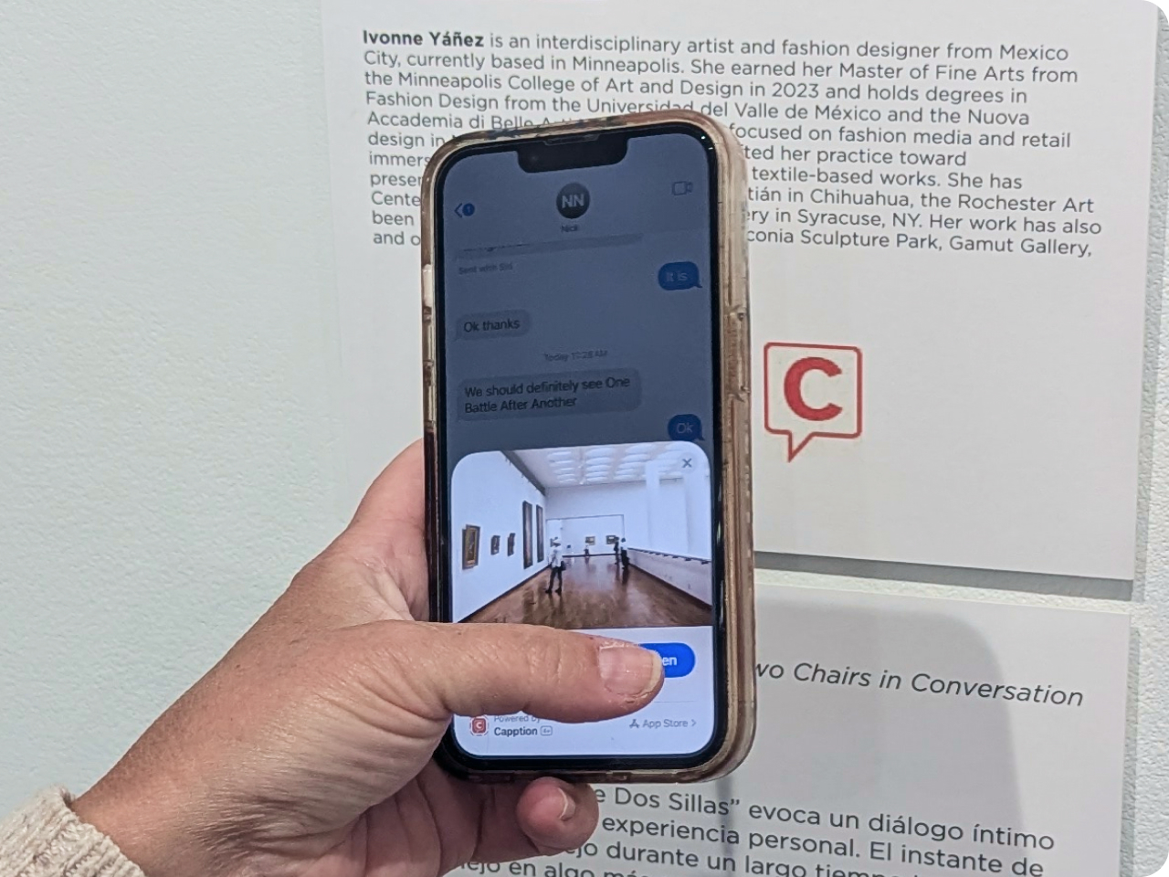
Feature split — accent-mid panel
Right-side content
Used for feature pair where the heading lives in the colored panel.
About card
Used on the About page to present values, traits, or mission points with consistent padding and shadow.
American Swedish Institute
Highlight card — used on the News and Partners pages for featured partner moments.

hello@capption.com
Contact method card — used on the Contact page.
The verdict
Verdict banner — used on VS pages to deliver the comparison conclusion in a navy box.
At a glance
Capption
VS glance card — Capption variant. Navy background, white text. Paired with the competitor card.
At a glance
The Competitor
VS glance card — competitor variant. Neutral-50 background, body text color.
01
Key differentiator
VS diff card — used to enumerate Capption advantages in comparison pages. White card, numbered accent label, bold title.
Pricing card
Used on the How it Works page to present pricing in a contained white card against a dark section.
Institution name
Exhibit title
Demo exhibit — see full widget below.
Badges & pills
.audience-pill (always on .section--dark / dark bg)Forms
Form controls
Form wrap (on dark section)
List patterns
Why steps (auto-numbered)
- First step — numbered badge auto-generated via CSS counter.
- Second step — used to walk through workflows or processes.
- Third step — badge color is --clr-accent on --clr-primary-tint.
Why feature list
- 01 Bold benefit title. Supporting description that explains the feature in plain terms for a museum director.
- 02 Second benefit. Continues the pattern with numbered accent labels in Montserrat.
News event list
Event description — institution, venue, and brief detail.
Another event with a different badge variant.
News item list (dark)
Recent news copy — used in the dark section of the News page.
Older news item with date column and white-tinted text.
Callouts & stats
Pull quote — a key statement set apart with an accent-blue left border. Used on the About page.
"Why quote — a tinted blockquote with accent left border used in research article pages."
— Source or institutionof visitors have challenges that inhibit exhibit access
Tester outcomes
Exhibit widget
The .demo-exhibit card is used on demo.html to present each live exhibit. It combines a banner image, institution label, heading, descriptive copy, hint text, and the Capption icon trigger.
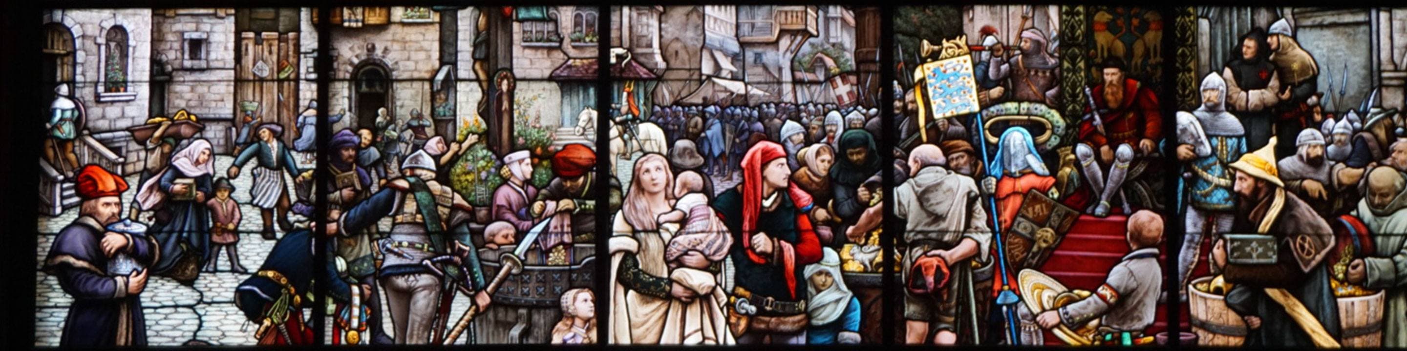
American Swedish Institute
Visby Window
The American Swedish Institute is a cultural mainstay in the Twin Cities. As you ascend the Turnblad Mansion's historic staircase, this glorious stained glass comes into view. Tap or click the Capption icon to learn about the Visby Window with Capption.
This is a standard Capption experience — great for first-timers.
 Tap or click the icon
Utility classes
Color — text
.text-primary-brand — #003b74
.text-accent — #3691ff
.text-muted-brand — #8e98a8